…That’s ‘Positive Mental Attitude’ for ‘Progressive Web Apps’…
We keep on getting requests to cover PWA/RWD’s and because we’re not DJs or that small band at the back of the bar that’s playing ‘only originals’, we’re taking those requests…and 5-6-7-8…
So a PWA is a progressive web app and an RWD is a responsive web design. How are the two related? Well first off, “RWD is basically writing your HTML5 and your CSS code so that the layout of the site will flex and change depending on the size of the screen of the web browser that is visiting your site. So if you have a smartphone or a 75 inch flat panel TV, a properly coded responsive website or web app will look just fine.” So the idea being that fonts, images, layout, etc. will change size depending on the size of the screen you’re viewing them on. As you can imagine, with the way consume data and media, it was a pretty big deal.
Okay, but where does the PWA come in? “…A PWA is basically taking RWD to its ultimate highest level. Essentially…you can think of it as RWD on steroids, because it brings in all the power that comes with native HTML5 and CSS (and you throw in some JavaScript to add some extra capabilities, of course…).” “The big advantage of using a PWA over native is you have one code base, so instead of having to write one app in iOS with SWIFT, and then having to write the whole app again from scratch for android in JAVA or KOTLIN. PWA is a lot cheaper to get your app out there, and [while] you don’t get the full benefit with a PWA that you get with native, you get a lot of the benefits.”
Now the VLOG will go into really good detail weighing the pros and cons of PWA or native (and believe me there are way more pros), but as a dev or a freelancer you should always be thinking about where businesses are coming from. Most of the time they’re not interested in the “nerd” implications of the languages, frameworks, etc. that you use, they just want to get up and running fast and get the product or service out there and PWA is your best bet. -ENJOY
For database driven websites (web apps,) typically the biggest bottleneck is the database. So be sure your database is optimized. With SQL based databases, that starts with proper table design and smart indexing. That will handle 98% of websites performance needs.
In terms of client side code (HTML5, CSS3, JavaScript,) it comes down to lazy loading strategies, the use of CDNs, and being sure you don’t have boatloads of JavaScript slowing everything down.
How about image optimization?
Back when I started building websites, in the day of the dinosaurs (1990’s)we used to be concerned about image size, and how ‘big’ the webpages were in terms of kilobytes … but we live in the YouTube generation now, with high speed mobile internet, HD and 4k video being watched on smartphones. That means that a data limitation is typically NOT the bottleneck anymore … it’s processing (of code) on both the client and server.
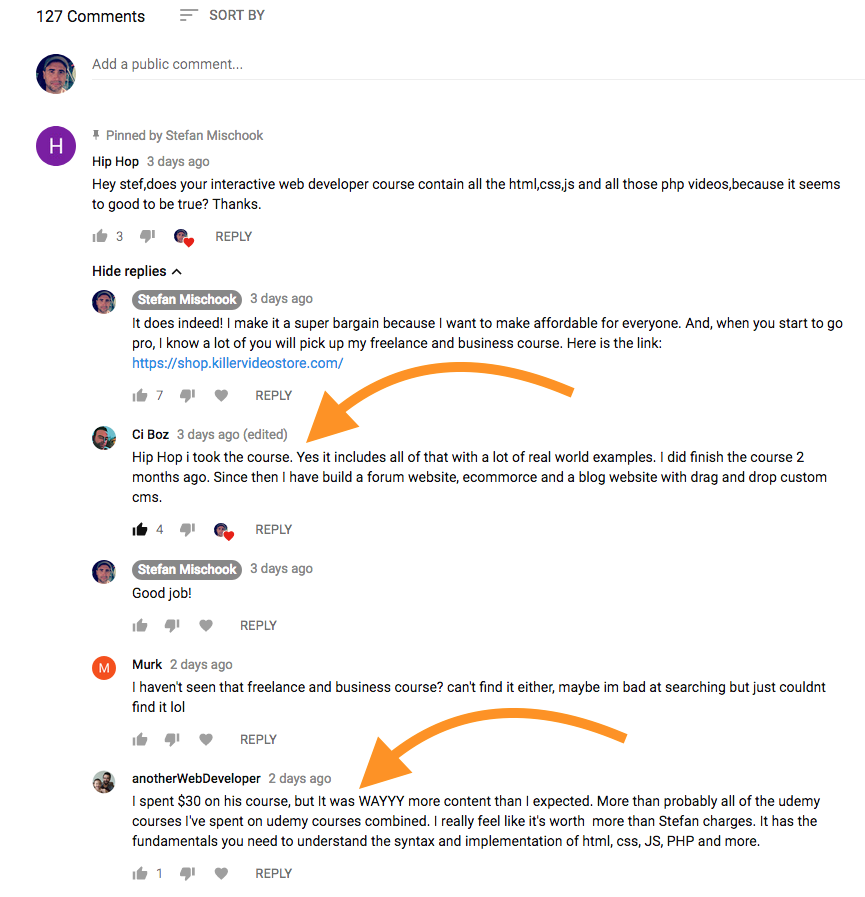
If you are reading this, you probably want to learn modern web design and development, or you may already know how to build websites, but you want to become really confident in your web skills … just like all my students who took my unique web design and programming training course.
After you take my course, you will be amazed at how much you know! Below, you will find a few student quotes, screen captured from YouTube comments.
I was recently asked this question from a student:
What do you think of Google’s new rating system to favor search results towards sites which are mobile-friendlier than other sites? Will there be a course to address this type of mobile-centric design in the future?
Yes, we have courses, both on Webmentor.org and on the killervideostore.com. Mobile friendly sites are called ‘responsive’ … because their pages respond and resize based on the device being used to view them.
I think Google’s move makes sense when you think about it. Google always wants to cater to a broader audience, and web surfing is more of a mobile thing today, than it is a desktop or laptop thing.
We ourselves are slowing making our sites responsive, so far the following have been converted: