SITE123 is 100% Responsive Web Design
April 3, 2017
Sponsored post authored by Site123
The concept of responsive design is not a big breakthrough, but it has attracted a lot of attention recently due to the growth of the mobile device market, mainly tablets and cell phones of varying sizes and resolutions.
In this new context of browsers and various resolutions, responsive design emerges as a logical evolution of website design, mostly known as web design.
Early on, much of the internet was composed by very similar resolutions and browser options. Until recently, it was just fine to make a website that worked on Internet Explorer with a maximum resolution of 1024 × 768 pixels and everything was solved. Of course, there were other features, but the vast majority was in the same group. At the opposite side of the spectrum, there were users of Mozilla Firefox. And that was about it.
Today, everything has changed. There are 50″ inch TVs accessing the internet, phones that have 2″ to 5″ screens, 5″ to 7″ “phablets”, 6″ to 14″ (or even more) tablets. And that is not including the computers themselves, which have screen sizes up to Apple’s iMacs, making it a range from 11″ up to over 26″ inches.
So let’s get started by asking one of the most obvious questions, which is of course, the first that comes to mind…
What is Responsive Web Design (RWD)?
One of the strongest waves that has recently invaded the world of technology is mobility. The “boom” in tablet and smartphone sales, as well as the high volume of Internet access through these devices, has made companies look at new behaviors by web surfers and move to adapt their sites to new screen formats.
However, with the huge variety of smartphones available in the market (each with its characteristics and screen dimensions), this task has become a challenge. How to offer an enjoyable experience for Internet users, regardless of the device they use? The answer is in responsive design.
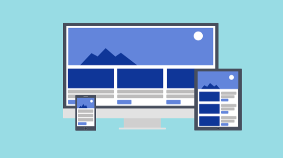
Responsive web design is one of the solutions for putting together a website so that the elements that compose it automatically adapt to the screen width of the device on which it is being viewed. Rather than creating two separate sites, one for mobile (smartphones and tablets) and one for desktops, you only make one website that will fit nicely on any screen it loads on.
Today, most commercial operations happen via mobile, so companies that do not tune their sites to different screen models can compromise users’ experience and thus lose a large chunk of the market.
Uh oh, things do not look too good for most companies, as you can see below:
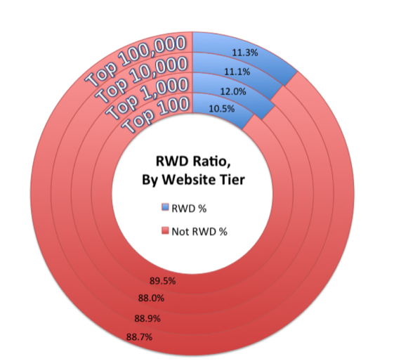
Source: Guypo
Although a little surprising, we see that among the top 100 website tiers, only 10% of the websites are responsive. Yes, you heard, read and saw it right: ten-per-cent, only.
The first question I bet the majority of readers are asking after seeing this is: Is my website responsive? Of course, followed by: Is my website mobile friendly? How to make a website mobile friendly?
Please focus in only one thing for now: you can easily handle this. So let’s take a better look at what you need in order to succeed.
A good responsive web design must:
- Adapt the layout of the page according to the resolution in which it is being viewed
- Automatically resize images so they fit on the screen and do not overload data transfer on a mobile phone, for example
- Simplify screen elements for mobile devices, where the user typically has less time and less attention during navigation
- Hide unnecessary items on smaller devices
- Adapt size of buttons and links to touch interfaces where the mouse pointer is replaced by the user’s finger
- Intelligent use of mobile resources such as geolocation and change of device orientation (horizontal or vertical)
Sounds complicated? No worries, SITE123 handles the technical part.
As you can see, responsive design is relevant. And to the point which it can even impact the relevance of your site to search engines (SEO). By avoiding redirecting the page to a mobile-only version, using a unique address for all devices, this URL gains more relevance in the search engines because it is used in all accesses, regardless of the device used. By providing a user-friendly experience, the responsive layout still prevents site abandonment and contributes to maintaining a low bounce rate.
This design technique has already been advocated by many for some time, but only recently it began to gain prominence after Google has indirectly confirmed that: for its SEO department, responsive design is the most appropriate. It’s easier for Google to realize that www. example.com has a layout that fits any screen than to understand that www.example.com, m.example.com, and tablet.example.com are all the same sites and are not just copying content from one another. According to the Google help page for smartphone design, the recommendation is as follows:
“Google recommends webmasters follow the industry best practice of using responsive web design, namely serving the same HTML for all devices and using only CSS media queries to decide the rendering on each device.
If responsive design is not the best option to serve your users, Google supports having your content being served using different HTML. The different HTML can be on the same URL or on different URLs, and Googlebot can handle both setups appropriately if you follow our recommendations.”
Again, no need to worry if Google’s explanation sounds a bit too technical. SITE123 automatically creates a responsive web design for your website – sit back while we do the hard work for you.
What Does Responsive Web Design Look Like?
Switching topics a bit, it is time to think in terms of looks. If the ideal website is to be seen in many different sizes and devices, how will it look like in the end? To answer that question, first we have to go over the screen sizes that are most popular nowadays.
There are several CSS frameworks trending that bring predefined values for layout breakpoints, such as the 320px, 480px, 600px, 768px and 992px common. No wonder, they are values derived from sizes of the iPhone, iPad and 7″ tablets.
All this pixel talk may sound a bit complicated in the beginning, but look at it again from this point of view: it should not be hard to understand given they derive from the sizes of the devices that are most commonly used by internet users.
On SITE123 for example, all websites are already responsive and work perfectly with all kinds of devices out there. From a tiny phone to a big screen, it fits all. In the end, your website will look very modern with the power to adapt to all screen sizes.
How Does Responsive Web Design Work?
Here are a few important things to note about responsive web design. Pretty much all you need to know.
- One URL – responsive websites have one main URL. You will not see other URLs like m.website.com and such. The address is the very same for your website on a computer, phone, tablet or whatever, which leads to…
- Single content – just like the URL, the content is the very same. No need to spend hours adapting image sizes, text positioning and others… On SITE123, you just throw in the content and it fits right into the design. When the website is browsed, it presents its full responsiveness by adapting to the size of the screen of whatever device it is browsed on.
- One code – your responsive website will have only one code for all devices as well. Of course you do not need to worry about this on SITE123 because no coding is needed. However, a simple explanation of the backend of your responsive website is that it is based on HTML, with a few other functions on top and it is adjusted for responsiveness by the…
- Media queries – Imagine an art gallery. Every visitor likes to enjoy artworks of a particular style… The media queries are like the gallery staff. They direct each visitor to a different room, according to what they like to observe the most. Media Queries are code functions that direct your site visitor to a different style sheet according to the device that they are using, resulting in…
- One website for multiple devices
Why Do I Need Responsive Web Design For My Website?
Optimizing loading brings fantastic results for user satisfaction and conversions. And this is even more true in the mobile world. Even modern smartphones are very limited devices. Low processing power, low memory, immense latency in 4G networks, etc.
Optimizing the loading part of your site is imperative. And here is a question: if you look to optimize your site for mobile, why not do it for desktop users? Why does the desktop version have to be slower than the mobile version? Responsive design delivers a website optimized for everyone!
Web sites with responsive web design are fluid and their content freely adapts to the screen resolutions of all devices. Both grids and images are fluid.
While content is the king, and the skill of being discovered in the virtual world is a measure of success, it is the user experience that allows visitors to consume the content on any website, whatever device they are on. Having a website with responsive web design is providing for a great experience regardless if your client is on a desktop, smartphone, tablet or smart TV. The responsive design caters to both the busy professional during the day and the student who needs to find results for researches. No scrolling or resizing so your site can be accessed on your favorite device.
An important fact to note regarding devices nowadays is that about 88% of internet users use multiple devices at once. The implication is that we have to make it easier for them to stick to our website instead of focusing on some other device/source of attention.
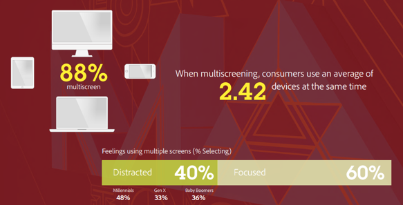
Source: Adobe
In addition, one responsive site costs less than two unresponsive sites and the savings can be significant when compared. Sites designed only for mobile phones do not offer the navigation advantages of a website traditionally designed for desktops. Responsive web design improves search engine optimization (SEO) since it has all visitors targeted to a single website, no matter which device they prefer to use.
Sites with responsive design have a unique URL, regardless of the device. This makes it easier and more efficient for Google to search, index and organize all content. Compare this to a mobile site that has URLs that are different from its desktop version, requiring Google to search and index multiple versions of the same site. The responsive one is light-years ahead.
In addition, Google prefers responsive web design because content that is organized this way, with the same URL for all versions, is much easier to share, integrate and link than content that stands on a site separate from the mobile version.
Also, having two separate sites, one for desktop and one for cellular, demands managing two SEO campaigns. Managing just one website and one SEO campaign is a lot easier than managing two websites and two campaigns. This is a key advantage that responsive web design has over having a separate mobile version. With this in mind, there are benefits to having a mobile-specific SEO strategy, such as optimizing for keywords that are most likely to be used on a smartphone. For example, someone looking for a restaurant using the cell phone, will be more inclined to find the term “nearby” in their search. However, an SEO strategy for mobile does not demand a separate mobile site. Nothing prevents you from using mobile-specific keywords on a site that can be used on a desktop.
If we are talking about better performance, we must inevitably reiterate how important it is that your website is responsive, especially in a time when people consume information and content through all kinds of devices. If the website is not optimized, your audience gives up and leaves.
The responsiveness of a website serves users and guides them through the entire content to reinforce the brand and information you would like to get across to your visitors. Otherwise, they get annoyed and feel they want to leave your website. According to Adobe, an astounding 38% of people stop engaging with a website if the content or the layout is unattractive.
How will my site appear on a mobile device?
After going through all the important aspects of responsive web design, it is now time to dive into the really fun part and get hands dirty. Let’s see what you can add to your responsive website to be shown on various devices, especially mobile. There are quite a few options available in terms of tools on SITE123 to get the most out of making a responsive website.
The most important thing here – responsive web design templates – are chosen right up front while registering. The only work you need to do is select your business category.
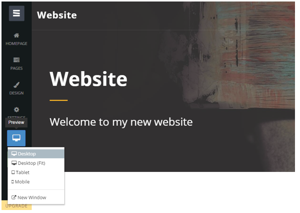
Once you are on the website editor, you can get to know your site on various devices. Preview the layout as you will see it on your mobile phone, tablet, desktop… Make sure you try them all and see how the content adapts according to each preview option you choose. If you are still wondering or have not found the preview button yet, it is the blue button on the right side menu.
Now that you have a sense of how your website will end up in terms of responsiveness, it is time to play with some of the funnest options SITE123 offers:
- Audio and video files – try adding different types of media to your website. Sometimes just images and copywriting will not cut it. Depending on the type of product or service you offer, it is a great idea to add audio and video files to your site.
- Promo Page (banner images and parallax scrolling) – when you go to the page options, you will note that there are a few simple yet important modules among the other pages, which are the promo pages. You can add banner images and take advantage of parallax scrolling to make your site look more enjoyable.
- Homepage Style – the most important part of your website is your homepage. Make sure you take the necessary time to tweak it until perfect. Many style options are available and within a few clicks you can set up exactly what you need.
- Flexible Layouts – one of the strongest aspects of SITE123 is the beautiful range of layouts. They are flexible and fit many purposes. Try playing around with them and see which one is the best for your needs. They will adapt and fit perfectly on whatever device given the responsiveness of SITE123 templates.
- Video & Photo Galleries – having a gallery is mandatory for many kinds of websites and businesses. Among the page options you will find some gallery designs.
- eCommerce & Product Page – with everything set up it is important to make some money off your website and get good ROI (return on investment). SITE123 helps with that by providing an easy to use ecommerce platform. The same is true about product page options.
- Google Maps – for local businesses and organizations that have at its core the routine of receiving clients, suppliers, dealers, partners and such, there is the Google Maps tool. With this feature, your address will be displayed on the map right on your website and your visitors will have to look no further into how to get to your facility.
- Domains – last but not least, and definitely indispensible, are domains. You can choose yours right on the website editor or on the management interface. Just do not forget to get one. You do not want your website to have even a tiny bit of unprofessional look after all your hard work.
Conclusion
SITE123 gives you a perfect responsive website, fully adapted to all kinds of devices and screen resolutions. Forget all the complex coding part and jump right into designing your website and developing your content. Think up your strategy and what you need on your website. Then play with all the features available and give the little touches needed.
The hard part is done by the SITE123 team. All codes, media queries and CSS functions are well taken care of so you can just sit back and enjoy the website building platform. Within a blink you will be done with your website and without any effort it will be 100% responsive, fitting all devices and screen resolutions in the market.


