In this simple tutorial, we are going to use Adobe Illustrator make buttons that have a glass-like look to them.
I’m using Illustrator rather than Photoshop because once you make your button in Illustrator, you are left with a much more flexible button graphic that can be used to make more buttons of different sizes.
… This is thanks to Illustrator being a vector based program/application – vector graphics can scale up or down without losing any resolution.
On the other hand, Photoshop based images are pixel based, as such, if you scale/resize a button made there, you will see a degradation of the image quality.
Let’s begin:
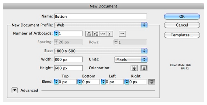
Step 1: Open Illustrator and create a new “Web Document” of 800 x 600 pixels. Make sure “pixels” is used as a unit.
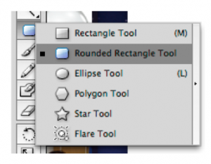
Step 2: Select the “Rounded Rectangle Tool” under the “Shape Tool” and click once on the artboard.
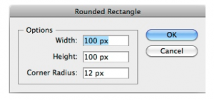
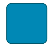
Step 3: Make a square of 100 x 100 pixels with a corner radius of 12 pixels.
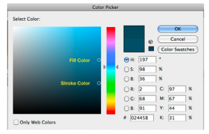
Step 4: Select your square and give it a fill color by double clicking the “Fill Color Tool”.

Step 5: Give it a slightly darker stroke color as shown in the screen capture.
This will be our base shape.
Step 6: Select the square and press “Command + C” to copy (“Ctrl + C” for Windows users) and then “Command + V” to paste in front. This will position our copy square right on top of the first one.
Step 7: Select our new square and holding down “Alt + Shift” take one of the corners of the bounding box and resize it to a slightly smaller square.
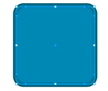
Step 8: Remove the stroke from this smaller square by selecting the stroke color tool and then press the “ / “ key.
Step 9: Apply a gradient to the smaller square by selecting the Fill Color Tool and then press the “ > “ key.
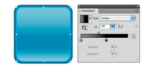
Step 10: Bring up your gradient palette with “Command + F9” (Mac) or “Ctrl + F9” (Windows) and apply a linear gradient type with 90 degree angle gray to black like is shown in the image below. Make sure the black is RGB black, which is darker than CYMK. Then set a “screen” blend mode to the square.
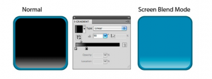
Step 11: Select the small square and press “Command + C” to copy (“Ctrl + C” for Windows users) and then “Command + V” to paste in front. Rotate the new square 180 degrees.
Step 12: With the latest square selected open the “Gradient Palette” again and modify the gradient to look like the one shown bellow.
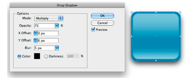
Step 13: Select the original base square and go to the “Effect” menu. Choose Stylize > Drop Shadow.
Now the only thing left is for us to add the content of our button. I have the RSS logo ready here. I applied a soft gradient from gray to white and a light
drop shadow. If you are doing text you have to convert it to outlines before you can apply gradients and shadows to it (“Command + Shift + O” for Mac, “Ctrl + Shift + O” for Windows).

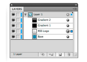
Step 14: We change the depth of the RSS logo. We have to place it underneath the squares with the gradients so that it gets affected by the “screen blend mode”.
There we have it; a nice and simple way to make glass button. The best part is that modifying this button is extremely simple.
New color: just select the base square and give it a new fill and stroke color
New size: select all items and resize to your liking.

Saving the button: With nothing else but your button on your document, go to the “File” menu > Save for Web and Devices. Select the PNG-24 preset and check “transparency” so that your button blends to the background in your website.
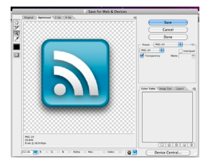 Click save and on the dialog box on the “Format” section select “Images Only”.
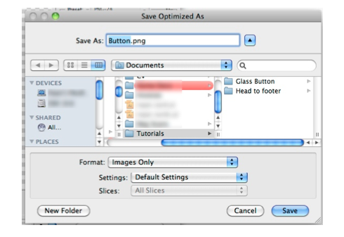
To insert your button in your website and make it a link you only need the code bellow:
<a href=”link”><img src=”path/button.png” width=”100″ height=”100″ /></a>
In the exporting step I chose to use PNG over GIFF for a couple of reasons. First, PNG has better compression than GIFF and PNG is lossless. Although PNG may have some trouble rendering in older browsers, let’s be honest, no one should be using Microsoft IE anymore – download something better!
4 responses to “How To Make Glass Buttons Using Adobe Illustrator”
“No one should be using Microsoft IE anymore”? I hope you mean IE6 and below. IE –in all its iterations– is still by far the world’s most popular browser. Ignoring that fact doesn’t seem wise to me.
That said, nice tutorial.
Rick: You are right to say ignoring IE is not wise. You should always try to design your websites to render correctly in all browsers to reach all your audience.
That said, my comment on staying away of IE is based on its smaller compliance with web standards in comparison with the other browsers. Although I must admit latest version of IE seems to address may of this issues.
Thanks for your comments on my tutorial.
Really liked this tutorial, although for a noob like me, I would’ve done a couple of things differently.
– Step 2-3 has some good screenshots as to what tool needs to be selected, step 8-9 don’t, when they are crucial.
– Step 11-12 are talking about rotating (no info on how to do that ended up finding the ‘Free transform tool’) and the gradient screenshots are rather small to really see how it should look.
Also regarding PNG and IE, I would simply suggest to those users to use this nice Javascript:
http://www.dillerdesign.com/experiment/DD_belatedPNG/
It’s been a blessing when dealing with transparent PNG and getting them to work on IE6-7 🙂
I second that… No one should be using IE (either 6, 7) anymore! I personally think its just a case of laziness if someone cant click a download button to initiate a better browsing experience.