Greetings and Salutations budding graphic designers!
In the second part of our discussion on typography, we will be looking at the secrets of contrasting type effectively. In our last article, we saw the different categories of typefaces and examined their historical origins. With that knowledge in hand, it’s time to apply it to our work.
How to Contrast Typography
I had mentioned earlier that the task of trying to decide which of the hundreds, if not thousands, of typefaces to choose for a particular job, can be a daunting one. However, making the right type choices is not difficult when you know how. This knowledge will be indispensable when creating a brand or logo, laying out a website and using CSS, or even writing a CV.
There are many ways to effectively contrast type and different designers will advocate their personal preference. However, most methods are usually found within the following descriptions of contrast:
- Size
- Weight
- Shape
- Type Category
- Direction
- Color
Good type contrast can be achieved by using only one, or a combination, of these methods. While it’s not necessary to use more than one, it is often recommended for a greater degree of contrast. Don’t get too carried away, as it’s not always the best idea to use all six at the same time.
Size
The contrast of size is a common on when discussing graphic design. A good way to think about this idea, is to remember that when things are slightly different in size, the often don’t have enough contrast. You might say that they actually create a conflict instead. Therefore, if it’s not different enough, it looks like a mistake. For example, headlines set at 14 points and body texts (paragraphs) are set at 12, the contrast is usually ineffective. Set those headlines to 16 or 18 instead and add some other contrasts like weight and color for maximum contrast.
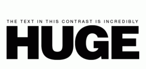
This example shows the importance or emphasis of the word huge. It’s the first thing you look at, letting the viewer know what is most important. Notice how the text is also making use of more than one contrast. Weight is also being employed by the HUGE text to make it stand out from the text on top.
This example uses size (as well as some other contrasts) to emphasize the name of the company. It’s not more important to know that they’re incorporated than to know their name. The information is there if needed, but not overpowering the company name. See how incorporated is also more spread out so that it aligns with the edges of the larger text.
Weight
The contrast of weight can be understood by thinking about the thickness or how heavy the strokes of the typeface look. While it’s generally recommended not to mix more than one typeface from the same font category or family, this can still work if the contrasting font is a bold or thicker variation. We saw how all of the previous examples used size and weight as a contrast. Both also use type from the same category, sans serif in the first, and slab serif in the second. If weight and size had not been used, the contrast would have been too ineffective.
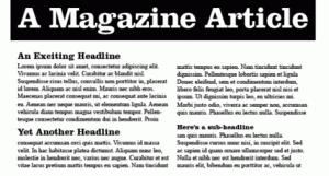
In this example, the contrast in the main title is quite noticeable. It is the main focus and as such, it is the biggest element of type. The weight of the slab serif, which is repeated in the smaller headlines, is a start contrast from the thinner sans serifs in the paragraphs. As well, the black and white contrast in the title makes it heavier and easily the main focus.
Shape
The shape or form a word takes is directly related to whether it has been set in Upper or lowercase letters. As we learn to read, we begin by phonetically breaking down the sounds of letters (C-A-T spells cat). However, once we learn what the word cat looks like, we eventually abandon the phonetic pronunciation and instantly recognize the way that word looks due to years of practice.
Surprisingly the shape of the word cat is easier to recognize when it is in lower case. In fact all text is easier and faster to read when set in lowercase, or a mix of caps and lowercase, than when it is set in all caps. For this reason, you should never set your body texts, or paragraphs in all capital letters. It is too difficult to read and it looks atrocious.
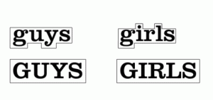
The shape of guys and girls are easier to make out when we can see lowercase “g” and “y” dropping below the baseline on the rest of the lowercase letters. The same can be said for the dot in the “I” and the lowercase “l”. However, notice that the shape of the uppercase examples both form square shapes. This makes their shapes indistinguishable and more difficult to read at smaller sizes.
Shapes can be used as an effective means of contrast as is seen in this example. Along with size and weight, the mixes of upper and lowercase text help to improve the contrast of these words. The same is true of the previous example of “killersites incorporated”. What is also important to note about shape is the amount of space between letters. The word incorporated was much wider spaced than the word “killersites”, which was much closer together, affecting its shape.
Category of Type
In our last article, we looked at how to categorize any typeface. By looking for 3 distinct hallmarks, we were able to place any font into the categories of Oldstyle, Modern, Slab Serif, Sans Serif, Script or Decorative. As was mentioned earlier, it is usually most effective to contrast typefaces from different categories. For example, contrasting two fonts from the Sans Serif category only works when other contrasting methods are employed. When thinking of which categories to use for a contrast, remember to avoid anything with too many similarities. A serif font will always work with a san serif. Always remember to avoid contrasting 2 different scripts fonts. They will compete with each other for attention and ends up creating confusion on your page. It’s kind of like too many divas fighting over who will be headlining the show. If script fonts are divas, then decoratives are like toddlers fighting for their parent’s attention. Avoid using more than on decorative on any given page, for the same reasons as before. As well, never mix a decorative and a script font, they usually don’t work.
When in doubt, always remember: do not to mix more than two different categories in any given situation. At best, and only if you know what you’re doing, should you attempt to use three.
Here is the same example from before, but notice how we’ve now contrasted a sans serif with a slab to heighten their differences. It also uses contrasts of size, weight and shape.
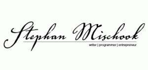
This example effectively contrasts a script with a sans serif. Size, shape (all lowercase in the sans serif), and direction in the lines are also contrasted here.
Direction
Direction is a useful contrast that draws interest by changing the way someone reads type. It is best when used with the other contrasts and can be used to contrast headlines, and logo elements as well as anything else.
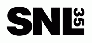
Not only is this example contrasting direction, but it also aligns the number into the negative space of the letter “L”. This creates a box shape with the rest of the uppercase letters.
This example directs the user’s attention down in the direction of “.com”. It’s also aligned from the top to the bottom of the letter “m”. When aligning text shapes, this about fitting a puzzle together.
Color
Color contrasts are a great way to add a simple element for emphasis or effect. Color would need a whole article to cover all of its complexities and psychological implications. However, we can simply state that the use of color as a contrast in text can be one of the easiest ways to communicate a message to your audience.
Some things to remember are the differences between hot and cold colors. Reds, yellows and oranges, represent the hot colors which advance, or seem to jump off the page. Blues, dark greens and purples; represent cool colors that usually recede into the background. For more information on mixing colors see adobe.com’s excellent tool for creating color swatches at http://kuler.adobe.com/.
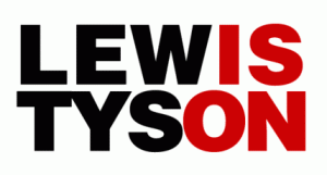
Fight fans might remember the infamous rematch between “Iron “Mike Tyson and Lennox Lewis. The designer’s for that match used color extremely effectively to emphasize the phrase “is on”. In other words, fans who were anticipating this bout didn’t need to know when, how much or where the fight would take place. That information could be found later. For now, all that was needed to be communicated was the fact that the fight “was on!”
The choice of weight in these words was important as well because this was a heavyweight bout and anything thinner would have felt inappropriate. The color red is psychologically reminding us of aggression, passion, and violence. Someone could lose an ear during this bloody match.




One response to “Fundamentals of Graphic Design Typography: Part 2”
I read through this page and it did added to me. I took intrest in graphic arts of recent and I’ll love to share more from you. Thanks