
Greetings and Salutations budding graphic designers!
This article is the first of many addressing a pressing need within the Web Design community. Many beginners learn how to work with HTML and CSS but never seem to be able to recreate some of the fantastic looking websites professionals build for their clients.
The main reason can be found in the beginner developer’s lack of graphic design skills. I can swing an axe and use a garden hose; but it doesn’t make me a fireman.
So too can someone learn how to put a .jpg on a HTML site; though it doesn’t make them a web designer. So, the good people behind killersites.com have commissioned the next series of articles to help beginners learn how to design like the pros.
Our journey begins by taking a closer look at typography.
The Categories of Typography
Have you ever been sitting in front of your computer and been left dizzy after trying to decide which of the hundreds, if not thousands of typefaces to choose for a particular task. This can be daunting for the expert let alone a beginner. Yet understanding type is most likely one of the single most important aspects of any design challenge. If you can navigate these stormy waters, you’ll be well on your way to making informed and beautiful typographic decisions in all of your future work. And so, we’ll first look at the different categories of type and their historical origins.
Before we begin, I’ll mention a number of textbooks that I often recommend to my design students.
Ellen Luptin’s “Thinking with Type” is a great primer that also has a good accompanying website . It’s a great place to get started and will also cover areas that are looked at only briefly in this article.
“The Non-Designer’s Design and Type Book” by Robin Williams (no, not that Robin Williams) is a wonderful starting point for most beginners who have no formal training and wish to jump right into design.
James Felici’s “The Complete Manual of Typography” is a much more in depth look at type and typesetting on the computer. I would recommend this book for the intermediate level design student who is also interested in desktop publishing, or type for print rather than the web.
Finally, I can also recommend “The Elements of Typographic Style” by Robert Bringhurst. This work is perhaps the most long-winded of all the recommended texts and probably the driest of the bunch as well. However, it’s the one you’ll most likely find on the syllabi of most design professors in universities across Europe and North America, as well as on the bookshelves of most professionals working in the industry.
Now that we’ve dispensed with the formalities, let’s take a look at different typefaces.
One of the easiest ways of understanding type is by attempting to place the typeface into one of six different classifications. They are:
- OldStyle
- Modern
- Slab serif
- Sans serif
- Decorative
- Script
In order to classify any font, you will be looking for three distinct hallmarks to help you in your task. We will look at these more closely on an individual basis, but to start, the hallmarks are:
- Inclusion of a serif
- Thick and thin transitions
- Stress lines
Oldstyle
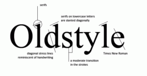
The oldstyle typefaces were created in Italy in the late fifteenth and early sixteenth centuries. Typographers modeled their fonts after the handwriting of the Italian humanists. For this reason oldstyle fonts have distinct features which are reminiscent of script, though they are not script fonts (that will come later).
The three hallmarks mentioned earlier are all created in this first category because of its origins. Oldstyle fonts always have serifs which are angled diagonally, much like handwriting created with a calligraphic pen would. That same pen would also create moderately thick/thin transitions in each stroke. Finally, if you were to draw a line through the two thinnest parts of a circular letterform, you would find a diagonal stress line.
The importance of classifying a typeface becomes increasingly important with the message your design wishes to communicate. If your message is one of a classical reference, a reputable institution or company, or anything steeped in tradition or history; then an oldstyle font may be the best one to choose.
Some examples in this category are: Times, Goudy, Palatino, and Garamond.
Modern
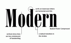
In the 1700s typography started moving towards a more mechanical means of production. As such, type produced during this period began to look less like handwriting and more mechanical in nature.
Modern typefaces have the same hallmarks as the previous category of type, however they are quite different. The striking appearance of these fonts is highlighted by horizontal serifs that are very thin. As well, the thick/thin transitions in the strokes are radically different giving the type a very elegant look. Finally, if you were to draw a line from the circular letterforms thinnest points, you would see that the stress lines in these fonts are always vertical.
Some examples in this category are: Bodoni, Onyx and Ultra.
Slab serif
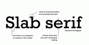
As the industrial revolution ushered in the age of advertising, typographers were confronted with the need for thicker type. Posters would need a stronger typeface to be seen properly from a distance, and so, the slab serif was developed.
The three hallmarks in a slab serif are characterised by a very mechanical looking font that is thicker than any used before. Serifs on lowercase letters are horizontal like in a modern font, but they are always thick. There is almost no transition in the thickness of the strokes, and because of this, the stress lines are always vertical.
Some examples in this category are: Clarendon, Courier, American Typewriter and Memphis.
Sans serif
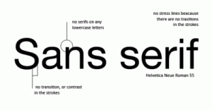
The most modern category of Type is probably the sans serif which was fully developed in the twentieth century. The word “sans” means “without” in French, so these typefaces are characterized by their lack of serif.
They are very mechanical looking in nature, but can be used any time a clean modern typeface is needed. The 1980s saw the creation of Verdana, which also points to the fact that sans serif type is especially favoured for onscreen legibility.
As was mentioned earlier, sans serif type has no serifs whatsoever. They contain no transitions in the thickness of their strokes which leads to a very modern, clean, and mechanical looking type. Since they are monoweight, there is no stress line in this category of typeface.
Some examples in this category are: Helvetica, Verdana, Gill sans, and Futura.
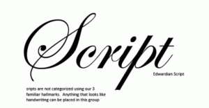
Script
Scripts can be categorized into many different subheadings. Calligraphic, pen or pencil strokes, markers and brushes. However, for our purposes, it’s easier for us to lump anything that looks like it was handwritten into this category.
There are no traditional hallmarks to look for in this category. Do remember never to set this type in all capitals, to use them at large sizes for dramatic effect when needed, and to use them sparingly.
Some examples in this category are: Arid, Vivaldi, Cascade, and Linoscript.
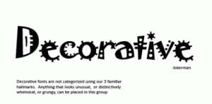
Decorative
These fonts usually take their name from their appearance. The can vary widely and are often distinctive and easy to recognize. The can give a work a very unique personality as some can be grungy, western, playful or even scary.
The three hallmarks are not used to identify these fonts. Remember to use these typefaces sparingly and never for setting paragraphs of body type. They work best as headlines and titles. They also crave a lot of attention on your page and should never be contrasted with a competing decorative, or script font.
…This will have the effect of too many divas on the page competing for the affection of your audiences, which contribute to a sense of chaos.
Some examples in this category are: Curlz, Lasso, Juniper, Fajita and Creepy.
Now that we’ve outlined the foundation of the categories of type, we will begin to see how this information can be used effectively.
In the next article, we’ll look at how to contrast type. This will be the key to creating logos and setting type successfully in any graphic design scenario. Whether you are creating type for a website a business card or a magazine layout, contrasting typefaces is an essential skill. The degree of your visual literacy will depend on knowing which font to choose and which one to contrast with it.

3 responses to “Fundamentals of Graphic Design – Typography Part 1”
Great video production! I was just wondering if you used final cut? Great work!
Thanks for this intro… greatly appreciated!
nice article….very helpful