Greetings once more budding graphic designers!

In our continuing series on the fundamentals of graphic design, we will examine the basic principles that will help your website design look more professional.
In our previous articles, we looked at typography and the many ways it is used successfully in the design world. We also looked at the importance of good alignment in any design. Continuing in this vein, we now examine the use of Contrast and how it can affect direction and the flow of your page by creating a clear focal point.
How to use Contrast
The concept of contrast is an extremely important tool in any designer’s toolbox. The Key to understanding it can be found in the principle that something looks like a mistake if it is just a little different. If something has been made intentionally very different, then there is no question of whether it was a mistake or not.
When discussing typography, we saw that a well contrasted selection of type is the cornerstone of a good logo. In GUI (graphic user interface) design, this is also true, and has the added effect of orienting the direction of your page, and creating a focal point.
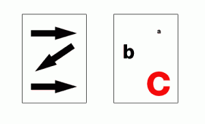
In this example we can see that as western audiences who read left to right, our eye naturally wants to follow the directions shown by the arrows. However, the graphic designer must act as the traffic cop of the page in order to change those habits.
As we can see in the example using letters, I have turned the natural inclination to read left to right on its head. We are drawn this time to the letter “C” at the bottom of the page first. This is not accidental, and is intentionally achieved by playing with contrast. The letter “C” is not only larger than anything else on the page; but it is also red, creating a focal point or “boss” of the page. It seams to say “look at me first, and then look at everything else on this page”. If the “C” and the “b” were the same size or just slightly smaller, we wouldn’t know where to look first. It would create a conflict rather than a contrast. So powerful is the attraction and direction of these letters, we see how it encourages not only an unconventional reading of the page starting at the bottom; but it also cajoles the audience into reading C-b-a instead of a-b-C. The designer has the power to pull your strings and manipulate your viewing habits.
Focal Point
The use of a focal point is essential in any good design because it helps us makes sense of the page. Contrast of size is usually how this is achieved and it is important for us to remember to be bold in our designs. Don’t be shy about your focal point, let it proudly show itself off and proclaim to the world “look at me, I’m large and in charge!”
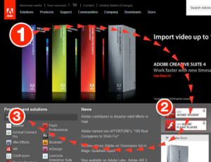
Notice how this principle is illustrated in the screenshot of adobe.com. The largest element creates a focal point that we are drawn to and naturally directs our eye to the important features.
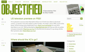
The word “objectified” is the most important element on this site promoting the documentary by the same name. It would only make sense to make it the most contrasted item by using size and color to draw our attention to it.
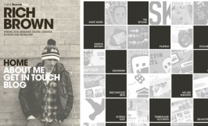
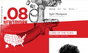
This innovative site draws our attention to the left side of the page by using good contrast. First, we can compare the size of the image on the left to the thumbnail boxes on the right and see an undeniable contrast of size. The designer’s name is of main importance and is naturally larger than the navigation links. The navigation is also important and we can see that they are larger than any other text element, besides the logo.
Not only is size used effectively to create contrast in this screenshot; but color is also a successful part of creating the focal point on this web page.
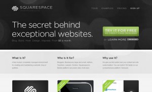
This site also uses color as a means of creating contrast. Not only is the header of the site heavier than the rest because of color, it is also drawing out attention to the most important element (the description of the product) and to the green “try it” button which is surely the goal of the site.
*Remember not to be shy or timid when trying to create a good focal point by using contrast. It is probably better to use only one element that is large, instead of multiple elements that are all the same or only slightly different in size and color.
2 responses to “Fundamentals of Graphic Design – Part 2: Contrast and Focal Point”
Indeed this article makes me want to rethink the contrast of my website. I will consider changing the contrast so that the I am in more control of the focal points.
Good article and excellent examples given.
This article was good, but somehow “MY” eyes were focused on the small “a” – top right – and moved to the “large red C” second. What does that mean?