Table to Tableless Migration
This tutorial requires intermediate knowledge of HTML/XHTML. It only requires basic knowledge of CSS. All of the properties I am using are being added to an embedded page style sheet, which is between the <head> tags in the document. You must use this to define header CSS: <style type=”text/css”> and </style>. Alternately, you can apply each declaration directly by using the style HTML attribute.
Converting an HTML table layout into a CSS tableless layout isn’t as hard as you might think. Setting aside positioning for a moment, each table cell will become a <div> tag, which is more commonly referred to as a layer.
Below is an image of a common table layout. This layout is very common to CSS as well.
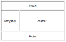
<html><head><title>My Website</title></head>
<body>
<table border=”1″ width=”300″>
<tr><td colspan=”2″ height=”40″>header</td></tr>
<tr><td width=”80″>navigation</td> <td>content</td></tr>
<tr><td colspan=”2″ height=”40″>footer</td></tr>
</table>
</body>
</html>
Changing each cell into a layer is as simple as changing each “td” to “div.” The table and tr tags should be deleted along with any layout attributes (like align or width) from your former table cells. In order to style one layer in particular, designers typically give it an id attribute. In the CSS, ids begin with #. For the web page to meet W3C XHTML specifications, a particular id can only be used once per page. If you name something id=”cat” you aren’t allowed to use cat again.
The class attribute, on the other hand, can be used as many times as you want. Its purpose is to allow multiple elements to access a single style. In the CSS, classes begin with a period (.). I typically name my ids according to what layer they’re attached to, such as “navigation” or “header.” I name classes according to what’s being styled, like class=”emphasis” (for important sections of content) or class=”list” (for special list formatting).
After making modifications to the code, you end up with something like this:
 <html><head><title>My Website</title></head>
<body>
<div id=”header”>header</div>
<div id=”navigation”>navigation</div>
<div id=”content”>content</div>
<div id=”footer”>footer</div>
</body>
</html>
Though it’s not necessary with a simple layout, you can also place a layer around all the others. It’s a little like a table tag to contain the layout. Usually, it’s just called “container.” I use it routinely because you never know when it will save you time in the end.
Now, for positioning…
This is the part that took me weeks to fully master. By default the layers are “stacked” on top of each other. This is called static positioning. They naturally span the entire width of the page but are, by default, only as high as the content inside. If there is no content then the height is zero. To keep track of the size and position of your layers, you may find it helpful to place a border around them by using border-width:1px; border-style:solid; border-color:red; You can also use the shortcut border property border (border:1px solid red;).
I consider the float property a member of the positioning category but it technically isn’t. Floats are used to shift layers to the left or the right of content inside of neighboring layers that are below it. The floated layer will ignore all non-floated layers so there will be overlap by default. Things like text or images will flow around a floated layer. Each layer is outlined in red in the image below. You can see that the content layer and the footer layer are partially overlapped by the navigation. It has the declaration float:left;.
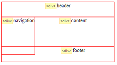
<style type=”text/css”>
#header {height:40px;}
#navigation {width:80px; height:100px; float:left;}
#content {height:80px;}
#footer {height:40px;}
</style>
The property used to create a float is just “float.” Its possible values are left, right, none, or inherit (from a surrounding layer). All layers have a float value of none by default.
To force a layer to move out of the way, you use the clear property. Its values are left, right, both, none, or inherit. Like the float property, the default value is none. If you style the footer layer with clear:left; it will drop below the navigation layer. Clear:right; clears floats on the right side of a layer while clear:both; clears floats on both sides of a layer. Clear:both; is needed when you have two layers near each other that are floating in two different directions.
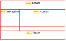
<style type=”text/css”>
#header {height:40px;}
#navigation {width:80px; height:100px; float:left;}
#content {height:80px;}
#footer {height:40px; clear:left;}
</style>
To create space between layers you use margin properties. There are four different settings: margin-left, margin-right, margin-top, margin-bottom. Alternately, you can use the single margin property that sets all four sides at once in a clockwise direction (top, right, bottom, left). The margin is always transparent. Valid values are any number positive or negative but you must remember to specify a measurement type. Pixels, or px, are most commonly used. Unfortunately, setting the margin doesn’t work on layers using clear:left;, clear:right;, or clear:both; on the side that’s touching the floated layer. This means it won’t work on the top edge of the footer. If you haven’t used a background color or a border on the footer, you can use padding on the top instead. You can see that the word “footer” has moved down a little. That’s the result of padding. If you have a background color or border, you will have to place a layer around the footer and add padding to it.
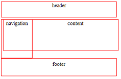
<style type=”text/css”>
#header {height:40px; margin-bottom:5px;}
#navigation {width:80px; height:100px; float:left;}
#content {height:80px; margin-left:5px;}
#footer {height:40px; margin-top:5px; padding-top:5px; clear:left;}
</style>
It doesn’t work the way you think it should on the content layer because of the overlap. It’s there, but on the far left. The right margin on the navigation layer isn’t visible.
There are two ways to get rid of the overlap while keeping the content on the right side of the navigation. One way is to also float the content layer to the left. The layers will then stop ignoring each other. Another way is to use a left margin on the content layer that is equal to the width of the navigation layer. This moves it out of the way. In order to have visible space between the two, width of the margin must be greater than the width of the navigation. If the navigation’s width is 80px then the left margin must be 81px or greater.
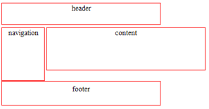
<style type=”text/css”>
#header {height:40px; margin-bottom:5px;}
#navigation {width:80px; height:100px; float:left;}
#content {height:80px; margin-left:85px;}
#footer {height:40px; padding-top:5px; clear:left;}
</style>
This is where a container layer would come in handy. The margin caused the content layer to expand beyond the width of the header and the footer, which is not something most people want. This happened because I have a specific width on the header, footer, and navigation. If I had a container around the entire thing then I could set the width on it instead. That would make it easier to control the layout. The red border around everything in the image below is the container.
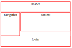
<body>
<div id=”container”>
<div id=”header”>header</div>
<div id=”navigation”>navigation</div>
<div id=”content”>content</div>
<div id=”footer”>footer</div>
</div>
</body>
<style type=”text/css”>
#container {width:300px;}
#header {height:40px; margin-bottom:5px;}
#navigation {width:80px; height:100px; float:left;}
#content {height:80px; margin-left:85px;}
#footer {height:40px; padding-top:5px; clear:left;}
</style>
There are other ways to position layers but they’re not directly relevant to this topic so I’m not going to talk about them in much detail.
- • position:absolute; – All other layers ignore it and it ignores them. The positioning is set by using the top, bottom, left, and right properties. Top and bottom cancel each other out as does left and right.
- • position:fixed; – Like absolute positioning but it doesn’t scroll with the page.
- • position:relative; – These layers reserve space even when they don’t need it. It uses the same positioning properties as the other two. Relatively positioned layers can also be used to contain absolutely positioned layers.
6 responses to “Table to Tableless”
Hi just found your blog.
Really good tutorial for beginers. It would have saved me tons of hours trying to figure out this float stuff.
I know lots of people who are afraid to trasition from tables to CSS based layouts because they think this is out of this world and really complicated. Actually it’s really simple (just gets complicated when you finish your beautiful layout and go test it on IE6 ,7 and 8).
But you really don’t need the container div. The body tag is already a container, just give it the width value. The less divs the better.
You should also mention how to center the layout with margin:0 auto;
To be honest, I’ve never thought about using a width on the BODY tag. I’m more likely to use left and right margins. The W3C CSS 2.1 specification doesn’t say that doing so is invalid so… But there are times when a container is necessary (such as using a background color/image on top of the background). It just depends on the complexity of the design.
“margin:# auto;” (where # is the numerical size of the margin) only works when there is a value for the width of the layer.
If you believe that a significant number of people are still using IE6, you need to add a few other things for centering to work. IE6 ignores auto margins. On the body: text-align:center; On the container: text-align:left; For some strange reason, an inline property works on a block in IE6. The second text-align is needed to align the text to the left in all other browsers.
Hi, i was following your tutorial, the only thig i noticed… the footer doesnt move down as the content grows…. it stays always the same place
is there a way to accomplish this?
This is a great tutorial I will be sharing with my clients for them to work on their wordpress posts. The inline css works perfectly when you don’t want to mess with the theme’s stylesheet.
Yeah this is great for beginners, but I still wonder how beginners get ahold of this bad advice anyways. Shouldnt most beginners be learning this style anyways I mean hell css has been revised 3 times now and some dumbasses still use tables. And good point about the IE6 hack necessary at the end.
Legacy is hard to kill. And up until say 2003, tables were really a must.
Hopefully soon the modern browsers will support CSS tables. God knows we need a grid UI system in web design.
Stefan